Windows 8: More on Metro

I have tried to use Metro as much as possible lately, mainly because enlightenment kept eluding me. For some reason I could never really get the hang of it, which made me think that using Metro the desktop was a bad idea.

I am nothing if not stubborn, so instead of giving up, I have been using Metro as my primary desktop for a couple of days now. To be perfectly honest, I like it more and more. My main concern was running multiple apps and switching between these. Normally I have a bunch of apps running at the same time, and I keep switching between them. This is very straight forward, when you use the desktop, after all, we have been doing it for 20 years, however, the Metro UI seemed difficult for me to use.

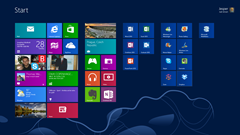
That has changed for me though. Getting used to moving the mouse to the upper left hand corner is rapidly becoming an easy thing to do, and the  notification I get, when a new mail arrives, or when I get a new IM makes a lot of sense. For instance, a new IM is shown in the upper right corner in a colorful metro-style bar, and allows me to easily switch to that app. Furthermore, I am really starting to like the full screen mode, which makes everything easier to see.

In addition, Scott Hanselman has a very good blog post about pinning useful stuff to the start screen, which greatly helped me making my start screen more useable. I highly recommend reading it.

Verdict so far: Looking better by the minute

Windows 8: Using Metro

I know we are not supposed to call the new interface Metro, but since that is how we have always talked about it, I think we will keep it for now.

So, the metro interface of Windows 8 has gotten its fair share of criticism lately. There are also a lot of people who like, however, why listen to others when you can try for yourself? Personally, I really like the Metro tiles on my Windows Phone; as far as I am concerned, it is much better than iOS, which I use on my iPad. The interface is designed for touch though, and since I don’t have touch capabilities on my desktop/monitor, the experience is somewhat different.

imageI have discovered that I still use the desktop as my primary “workbench” in Windows 8. Whenever I boot up the machine, I log into the desktop nine out of ten times I would guess. It’s not that the Metro interface sucks, but I seem to only use it for causal computing, much like I use the iPad. Pure consumption, no creation outside of an email or a chat once in a while. I am not sure I need to be able to boot directly into the desktop, or have the Start button for that matter, but I have yet to fully use Metro outside the aforementioned scenarios.

One thing about the Metro mail app is that it seems to crash when I used IMAP on my domain mail account, which sucks a little bit. I cannot map the folders either, which would have been nice.

The nice thing about Metro is of course the live tiles. Usually my computer is running all the time and whereas before, when I had to go through a whole bunch of applications to get updates, I get the whole thing in one screen now. Much like Windows Phone, I get all my updates at a glance. That is really nice. The downside is that since the same apps exist in Metro and the desktop at the same time, I get a lot of double notifications. For instance, try to chat with someone on Facebook using Messenger, while having Outlook.com and Skype open. I suppose it is my own fault for having everything linked to each other, but it makes for a weird experience.

Verdict so far: I haven’t bought a Mac yet.

Switching to Windows 8

I finally got around to installing the 90 day trial version of Windows 8 and Office 2013 this weekend. I have used the preview a little bit on an extra partition, but I have decided to go all in and only run Windows 8 on my machine. I like metro a lot on the Windows Phone, however, I have not been totally sold on the desktop, so now I am going to give it a real shot and try to work with it on an everyday basis.

I did a clean installation, which took around 15 minutes I’d guess, which is very fast. I think it could be done a lot quicker on newer hardware, but I am pretty impressed by the speed none-the-less. I am using 5 year old hardware, and so far I have had no driver problems whatsoever, which surprised me to be honest. I know OEMs are pretty good at back porting their drivers, but this is still a pleasant surprise.

imageI have also noticed that my computer runs quite a bit faster than Windows 7, which was fast as well. Come to think of it, the last two versions of Windows have definitely breathed new life into my hardware. I bought this machine during the Vista era and ever since my WEI score has improved with every new edition of Windows. Granted, it is not the most impressive WEI score, and I could probably benefit quite a bit from a new processor, but still, it suits my needs just fine.

for the time being, I don’t miss the start button, which many people have been complaining about, but I might in a few days. It takes a little getting used to having to go to the metro interface to do some of the thing I used to do with the Start button, but for now it doesn’t bother me.

Verdict so far: So far so good.

Trying Windows 8

windows8logoWhen the Consumer preview of Windows 8 launched I wasted little time downloading and installing the bits on a spare partition. I admit that I did not have the stones a to jump in with both legs, so I still retain a Windows 7 installation no my primary hard disk.

The installation process was very smooth, and all my peripheral devices work  without any problems. That includes a scanner and a Windows phone as well as a LifeCam, so no complaints there. I didn’t expect any problems either, and it is not really the most exciting feature of the new Windows OS.

For me, the Metro UI was the most interesting, mainly because I am a huge fan of the Bauhaus inspired UI that is used on Windows Phone. However, I must admit that I am having some difficulties getting used to it on a conventional mouse and keyboard set up. Although it is a lot of fun to use the Metro UI on Windows 8, I am not sure I will be using it a lot once I upgrade fully. I tend to have a whole bunch of apps open at the same time, and Metro does not really support my personal usage scenario. However, I am really looking forward to getting my filthy hands on a Windows tablet, since this UI is perfect for touch – no doubt about that. I think the tablet experience will be really good not only because the UI is fast and fluid, but also because it ties in very nicely with the web services that I use. Considering the technologies used to create the Metro UI I am wondering if Windows 9 will be some sort of shell that will tie all our web services together. Windows 8 does this really well already. There is a seamless integration with Skydrive, Flickr and Facebook to name a few, so all in all the future looks really exciting. Much more exciting that what Apple is doing these days at least.

Hopefully there will be a Nokia tablet, that can compete with the iPad; rumors are certainly plenty around the interwebs.  

Build: Hvad kan vi se frem til?

BuildMicrosofts Build konference starter den 13. september og  der har I længere tid været en hel del rygter på Twitter om hvad vi kan forvente at se.

Microsoft selv har givet den fuld gas med alt hvad den trække på kække one liners og marketing materiale, men kun tiden vil vise om det holder vand. Microsoft skriver selv:


In 1995, Windows changed the PC. BUILD will show you that Windows 8 changes everything.

If you are a contemporary developer, a geek who thrives on the newest and coolest, who loves the freedom of the web and the power of all devices from mobile to desktop, you need to join us to help BUILD the future.

Our approach means no compromises—you get to use whatever kind of device you prefer to run the apps you love. This is sure to inspire a new generation of modern hardware and software development, improving the experience for PC users around the world.

De to største ting vi kan se frem til er selvfølgelig Windows 8 samt den Windows 8 slate, som rygtet siger vil blive delt ud til deltagerne. Allerede nu kan man se, at der er nogle af de mere prominente bloggere, som allerede har fået Windows 8 at lege. F. eks. kan man se på Paul Thurrotts Twitter stream at han bruger Twitt@rama, som er en Windows 8 app.


Technorati Tags: ,,

Lidt Windows 8 lir

Her er den første lækkede video, der viser Windows 8, som det ser ud på nuværende tidspunkt. Det liger Windows 7 en del, men det skal man nok ikke regne med holder ved, da Microsoft angiveligt er ved at lave to nye UIs til Windows.


Technorati Tags:

Windows 8, nu med app store

win8appstoreDer kommer rigtigt mange leaks I øjeblikket, som omhandler Windows 8. Det sidste nye jeg har set er dette screenshot, som viser den kommende app store I Windows. Eller rettere, måske viser det den nye app store, endnu er intet bekræftet officielt.

Umiddelbart ser det ud til at UI konceptet lægger sig meget op ad Windows Explorer, hvilket rent funktionelt giver meget god mening. Jeg tror imidlertid at der kommer en form UI refresh I forbindelse med app store, da det er en funktionalitet, som vil få meget bevågenhed, men også fordi den ændre på den måde hvorpå vi henter nye applikationer til vores Windows maksiner.

Det bliver morsomt at se de uundgåelige sammenligninger imellem Microsofts og Apples app stores.

Technorati Tags:

Windows 8: Rygter

windows-8Det er ikke længe siden Microsoft frigav Windows 7, men allerede nu er der begyndt at komme en del rygter omkring hvad vi kan forvente os a Windows 8. Angiveligt skulle det være mere end bare rygter, da en række slide decks fra interne Microsoft møder nu er lækket på nettet.

Windows Kitchen skriver:

A big thanks to @floo1989 for the heads-up! Over the weekend, the Italian Windows site “Windowsette” got a hold of some super secret squirrel Microsoft presentations apparently laying around on the internet somewhere. I took a look through every single one of these, slide-by-slide, so I’m quite confident these are the real deal. I just feel bad for the poor sap who either leaked these or inadvertently shared these with the world. Long story short, these slide decks are chock full of internal thinking on Windows 8 — everything from customer target audiences to the Windows 8 developer market to the Windows 8 product cycle and much, much more. As a preface, I’ve taken many screen shots of relevant slides for inclusion with this article, so click on them to see their full-sized versions. I’ll elaborate on some and allow the others to explain themselves. Lastly, I’ll be updating this post as I find more contained within the slide decks. Now, without further adieu, let’s get started!

Continue at source

Kilde: Stephen Chapman  Microsoft Kitchen

Engadget har også en mindre artikel om de lækkede dokumenter her.


Technorati Tags: